Monday, 4 November 2024

Production Task One : Photography

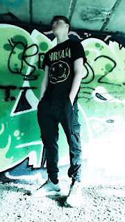
The process I took to get these photos involved asking a close friend of mine if he would be okay being a model for half of my photoshoot. I took reference from other female pop/rock artists are did some dark make-up with red lips for a hint of colour to keep in the theme of red and black being associated with this genre of music. I did the same for my outfit taking inspiration from, specifically, Avril Lavigne, using dark colours and more revealing clothes with some red with the roses in some of my photos. I wanted my background to be graphic and have hints at rebellion as many rock/pop artist and bands don't confirm to norms of society, so using a background which had colourful graffiti was a good way to make that link. I also got my friend to make it look like he was using his guitar for more variety within my photoshoot and use it as a possibility to show what the artist does with their music. As well as finding a record shop when I went on holiday to incorporate into my contents page or website to show another clear link that it is a music magazine and have filler photos which are relevant to my magazine and what the brief is, a music magazine.


Cover page 1(will be re-done with a different setting):


Contents page 1:


Cover page 2:


Contents page 2: 


On my website:


Thursday, 19 September 2024

Planning Task Eight: Photography Planning

For my first edition front cover I plan to use a white girl and for my second edition front cover I plan to use a group of white boys to clearly show the different demographics within my work, gender. I will be directing someone to help me take the photo for my first edition as I will be using myself as the model for the pictures, however for my second edition I will be directing the photoshoot myself.

For my first edition I plan on using an indoor setting. I will be sitting on a windowsill with my back facing outside with the windows open. The clothing props will be a short black skirt, a graphic top/hoodie and black boots. The makeup will be a very dark smokey look to emphasises the rock style I am going with. The hair will either been down or styled to look the part of a grungy rock artist. The separate props used will be red roses to included some colour into the photo, especially as red and black are mostly associated with rock bands and music. 

For the contents page of my first edition the main image I will use will be a photo of the main model facing towards the camera with a male model facing away from the camera but with his head slightly angled to the right facing the female model, not enough to see his features. (he will be the special feature that is mentioned). This photo will be taken in an outside setting and the male model should be either in shadow or all black to create the effect he is shadowed. The clothing will remain rock style with the female model wearing black chequered trousers and a graphic shirt. For the other photos that will be used in my contents page, they will contain pictures of records, musical instruments and other props related. 

For my second edition I plan to use an indoor setting. There will be a group of boys and they will be positioned on a sofa with a casual setting and posture. They will be dressed in black or graphic clothing. There will be a mix of direct and indirect eye contact and it will be made to look causal to show what they are like. 

For the contents page of my second edition I will have the main image being some of the models around a fire, again looking casual. It will be an outdoor setting at night to emphasis the effect that they are a dark rock band and to make the effect/light that the fire will produce brighter and better, adding in the colour as the rest of the setting will be black and dark. For my other photos that I will be using in this contents page it will be headshots of some of the models who are making up the band.



Monday, 15 July 2024

Planning Task Five : Mock Up of Cover 1 and 2

 Mock up 1 of my front page of my music magazine

Warning: The images used are not mine, however it is closely related to what I want my main images to be so I have used it to represent what mine will look like (will not use in my finished product and will use my own)


Friday, 12 July 2024

Planning Task Three: Masthead Design

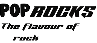
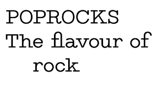
These are some font ideas that I had to find out what font I think works best for my ideas. In the end I decided to go with 'Neon Rave' as my font for 'Rocks' as it is sharp and pointy, representing rocks. and I decided to go with Bubble-gum as my font for 'Pop' as it resembles the smooth and roundness of bubble gum. To make sure I didn't have too many fonts I decided to stick with bubble gum as my font for the strapline as well to also have some consistency. 
This is the finished design for my Masthead and Strapline for my magazine

Production Task One : Photography

The process I took to get these photos involved asking a close friend of mine if he would be okay being a model for half of my photoshoot. I...